
How colour and language make up your mind
24 June 20266 min read
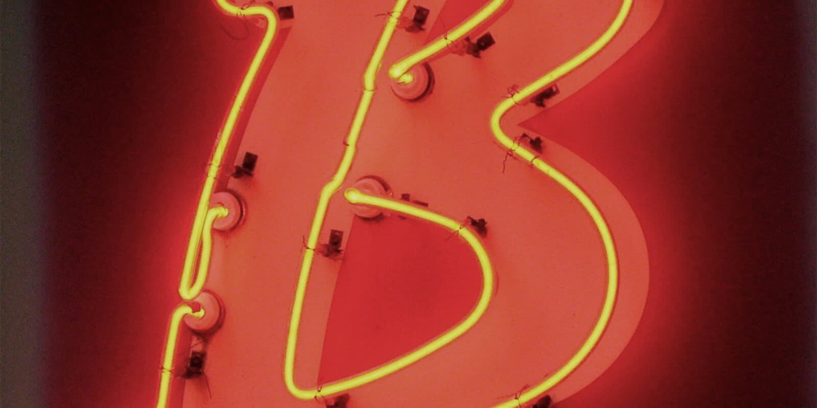
People rarely decide the way they think they do. Colour, words and order quietly cast the vote before reason arrives to explain it.
Ask someone why they chose the more expensive option and they will give you a reason, and the reason will usually be true and almost never complete. Before the reasoning arrived, a set of quieter forces had already leaned on the decision. A colour, a word, the order things appeared in, a price ending in ninety-nine. Behavioural science is the study of those forces, and design is where they are applied, whether we mean to apply them or not.
It helps to remember that most of what a person does on a screen is fast and automatic, not slow and considered. The mind runs on a quick, intuitive system most of the time and only calls in the slow, effortful one when it has to. Good design speaks to the fast system first. It makes the right action obvious, the safe path calm, and the risky path deliberate enough to interrupt the autopilot. Design that ignores this and relies on people reading carefully is designing for a person who rarely shows up.
Colour is never only decoration. It carries temperature, status, warning and mood before a single word is read. The same red does different work on a sale badge, an error message and a bank balance, so the fixed colour-psychology charts are close to useless. What matters is context and consistency. Meaning is learned, and your only real job is to use colour consistently enough, and honestly enough, that people learn what yours means and can trust it on the next screen.
Words are interface, not label. 'Delete' and 'Remove' promise different futures, and a person feels the difference even if they could not name it. 'You saved £20' lands differently from '20 percent off', because a loss and a gain do not weigh the same. People feel a loss roughly twice as heavily as they feel the equivalent gain, and that single fact quietly shapes half the good copy ever written. The wrong word does not just fail to persuade. It adds a flicker of doubt at the precise moment you needed confidence.
Design is not neutral. Every colour and every word is already an argument.
Order and defaults do more work than almost anything on the page. The first number sets the scale for every number after it, so the plan you show first is not neutral, it is the ruler. The first option frames the rest. And a default is a decision most people will never revisit, which makes it the most powerful choice on the screen and, too often, the one made by accident. Decide your defaults on purpose, because your users will not.
Friction is usually the enemy, but not always, and knowing the difference is part of the craft. A moment of deliberate effort in front of an irreversible action, a confirmation before you delete a year of work, is friction doing its job. Behavioural design is as much about slowing the wrong action as speeding the right one. The goal is not a frictionless product. It is a product where the ease of a thing matches how much you should trust yourself to do it quickly.
All of this can be used to help a person or to trick them, and the same knowledge does both. The nudge that guides someone gently to the plan that genuinely fits them is the nudge that traps someone in the plan that does not. The line is easy to state and hard to hold: use it to help the person do the thing they came to do, never to do the thing you wish they would. Dark patterns win the quarter and lose the relationship, and the relationship was the business.
None of this replaces judgement or care, and none of it should be worn on the surface. The point is simply that design is not neutral, and pretending otherwise just means you are shaping decisions carelessly instead of deliberately. Every colour and every word is already an argument. Make it honestly, in the person's favour, and they will never notice the science at all. Which is exactly how it should feel.
UX Companion
The UX dictionary in your pocket.
UX Companion is our UX-dedicated app. A carefully written glossary of the tools, terms and theories every UX professional should know. Each entry pairs a plain-language definition with practical implications you can apply in your work.
Have a project in mind?
We take on a small number of partners at a time. Tell us what you're building.